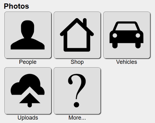
I'm getting design inspiration from my desk. I use three coasters there, remnants from Idaho, for everything from oatmeal to cocktail. I look at my site designs and see that I use a lot of similar squares, with distinct borders and shading. I believe layout should be emphasized, not made transparent.
Template notes: Menu items can be scrolled to directly by passing their name to a ?m= parameter in the url. So, if you click the image above I will take you to monarch/?m=photos.

